Tools to Make Your LinkedIn Ads Convert
As we discussed in our previous posts, LinkedIn offers amazing targeting so B2B marketers can reach the right audience with their ads.
In this post, we’re going to examine the anatomy of LinkedIn’s Sponsored Updates and review the best practices for making ads that convert.
How Your Updates Appear
There are basically two presentations for Sponsored Updates:
1. One that includes preview text from the link

This one pulls a description and image from the page to which you link. Keep in mind that description text does not appear in mobile.
2. One that just shows your Introduction Text and a larger image that you manually upload to LinkedIn:

Both Sponsored Update presentations have pros and cons. Which one works best for you will depend on your content and your persona(s). For some personas, you need to capture their attention quickly so a large, bold image is key; other personas will enjoy the article-like appearance with more text.
As always, when in doubt, A/B test.
Introduction Text: Draw People In
The introduction text should invite people to click your link. In general, keep the text short and sweet. You want to entice people further into your ad by appealing to a common interest among your persona(s).
One popular option is to propose a question that appeals to a pain point for your persona. Ustream, for example, asks “How do you boost the ROI of your video marketing?” The question is great: it’s not a simple yes or /no and many readers will want to know the answer. They then suggest a solution that can be found in their post:

If the ROI of your video marketing is a serious challenge for you, it’s hard to imagine passing up this ad.
Another option is show a stat that might surprise or alarm readers. Google, for example, tells viewers that 30% of online purchases are on mobile.

The first question eCommerce business owners might ask after learning this figure is “does our site focus enough on mobile users?” And that’s exactly what Google’s offer will help them answer.
The main takeaway is that you need to understand your buyer persona so your introduction text can speak to them. You need to know what appeals to them.
What bothers them?
What interests them?
What has been holding them back for so long?
And how can your offer help them?
Images: Make Your First Impression Count
Images are generally the first things people process, so take advantage of that.
Images are essential to generating leads with Sponsored Updates. The image not only needs to capture attention, it also needs to draw them further into your ad.
Make sure the image is consistent with the rest of the ad: it should share a similar tone to your content. You don’t want an image of a party hat leading to some dry professional text. Viewers will feel betrayed.
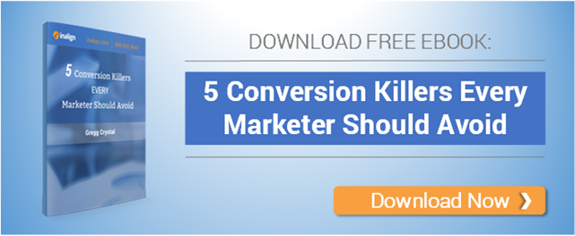
While some companies can get away with just images, we generally recommend using text within your image. It’s the first things viewers will notice, so why not entice them with a bold headline and/or offer?

(Note that this is really for manually uploaded images. The images pulled from your link are much smaller, so text might not be an option.)
In the image above, the viewer only needs to see the image to know what happens next: they click the link and download an eBook for marketing in the energy sector. The image can stand-alone or it can work with strong introduction text.
CTA
Technically, the CTA belongs in the introduction text or in the image (or both!), but it deserves reiterating: every ad should have a clear call to action. What do viewers do next? What should they expect?
You don’t want people to see your ad and just think, “nice ad” before moving on – you want them to click on it! Don’t just expect them to do it. Show them how to do it and why.
Conclusion
Every part of a Sponsored Update works together for the same goal. That goal is whatever action you want viewers to take.
We regularly see disjointed ads where the image sets expectations that the introduction text fails to meet. Or ads by which we’re intrigued but not incited to act.
The key to a winning ad is clarity and harmony. Everything in your ad should work together to get visitors to act. Otherwise you’ll be wasting your budget.